Supervox Blog

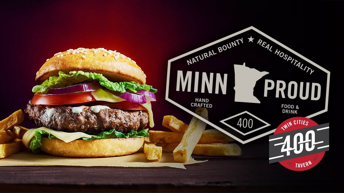
All aboard the Twin Cities 400

We did a count the other day. The number we came up with was 64 – Sixty-four restaurant and hospitality brands we’ve been instrumental in creating or building.

Some clients come to us at the very beginning of the process – say, after contracting with a building owner to put a restaurant into a new development. The first order of business is to figure out what’s appropriate for the neighborhood and compatible with the space. This happened with Salut Bar Americain in Edina, Minnesota. The space was offered to Parasole Restaurant Holdings, and as a member of their “kitchen cabinet,” we helped birth that baby. Firebirds Wood Fired Grill, on the other hand, was already well-established, with seventeen restaurants, when it contacted us for a brand update.

The Twin Cities 400 Tavern, however, was a first for us. We came onboard after the name and basic visual identity had already been completed by the restaurant’s architectural partner, Shea Design of Minneapolis. The trick was to bring the new brand to fruition in a way that A) built on the (really great) work that had already been done, yet B) incorporated all the latest thinking surrounding the concept.

Restaurants are so much fun to work on that it really doesn’t matter where we step into the branding and marketing process, and this project was no different. But it did present a few issues.

Guiding a train that had already left the station

The name, Twin Cities 400 Tavern, refers to an express train that set speed records between Minneapolis-St. Paul and Chicago in the 1930s – traveling 400 miles in 400 minutes. The restaurant’s visual identity captured the design aesthetic of the Twin Cities 400’s badge, and the exterior of the property featured a large graphic of a locomotive and rail cars.

Five minutes into our initial conversations with the owners, Scalzo Hospitality (a Minnesota-based, third-generation, family-owned business), it was clear how much pride they took in creating a truly homegrown restaurant. And just as quickly we saw our way in.

The hook wasn’t the locomotive per se, but what it represented. Like the train it was named after, the Twin Cities 400 Tavern could be a connector of people and an ambassador for our cities – a vehicle, as it were, to introduce visitors to the character and culinary heritage of the Twin Cities, while providing locals with an experience that would be approachable and familiar, yet rich with opportunities for discovery.

Now, plenty of local restaurants – not to mention the entire Minnesota State Fair – play on their Minnesota heritage, so we wanted to be careful not to go too far down that road with “Uff-da” and “You Betcha'” humor. Twin Cities 400 Tavern was serious about telegraphing its Minnesota roots and, more than that, its commitment to showcasing local ingredients, dishes, beers and spirits, and we felt it was important to honor that vision in a more straightforward way.

The needle we needed to thread

Our challenge was to communicate the restaurant’s Minnesota character within the existing brand framework. We came up with “MINN. PROUD.” This manifesto-style statement that appeared on menus, staff t-shirts and the opening billboard captured the driving passion of Twin Cities 400 Tavern. And it really came to life in the stamp-like framework we created for it – a design that wouldn’t have been out place on a train ticket from the era.

We also created posters, a billboard, PR (teaser and opening), elevator clings and TV screens, along with an email template and pylon signage design. Our digital strategist took care of local SEO, and we gave Twin Cities 400 Tavern a simple, functional website that adhered to SEO best practices and had a backend that was easy to use for content updates.

(You can see all of our work on this project at our Twin Cities 400 Tavern work page)

The entire project, beginning with a positioning and “elevator speech” and concluding with a brand guide, was a delight – mostly because the client loved the work, but also because of how smoothly it went, despite the potential for confusion arising from building a brand that had already been partially created.

But we created Supervox to be flexible and easy-to-work with. We work within the frameworks our clients bring to us, not ones we impose on them. Sometimes marketing agencies, especially ones with a strong creative bent, forget that. We need to remember that, like restaurants, we’re here to serve.